

Ink / on lightDownload PNG ↓
Brand / The Thread visual language
Clear, considered, and quietly human. Our identity, imagery, and product stories work together to make useful work feel tangible.
Take the brand kit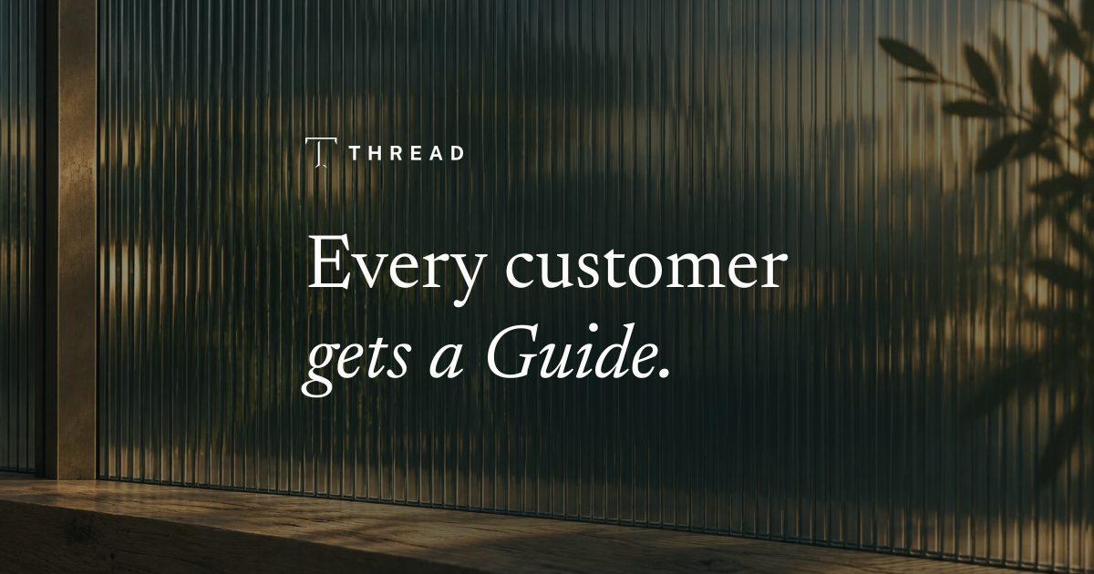
01 / Identity
The cut serif T and widely spaced wordmark are our constants. Use the original artwork, in a single color, with enough space to let it breathe.


Give the mark room. Leave at least one serif-blade length on each side. Use the tile in avatars and small squares; keep the standalone mark at least 24 px tall.
Keep the drawing intact. Preserve the gaps, proportions, and wordmark spacing. No stretching, outlines, gradients, glows, or added shadows on the logo.
Choose a quiet placement. Ink on light. White on dark. Over an image, use a calm, high-contrast area with consistent tone behind the entire lockup.
Use the supplied lockup. Its Public Sans wordmark is already outlined. Do not retype it. Brand assets do not imply a partnership or endorsement.
02 / Type & color
Newsreader gives the story a human voice. Public Sans keeps the website clear. Inside product views, preserve the app’s Geist typography and familiar interface colors.
Every customer
gets a Guide.
An always-on account manager for every customer.
Activate accounts. Grow adoption. Verify the result.
One account. One continuing conversation.
10:34 AM Source check · verifiedPaper, ink, and quiet neutrals carry the page. Green in the interface means a verified result; the natural colors of our imagery provide atmosphere.
Select a swatch to copy its hex value.
24 pxMedia and image frames
6 pxWebsite buttons
1 pxQuiet dividing lines
Space firstFew elements, clear hierarchy
03 / Imagery
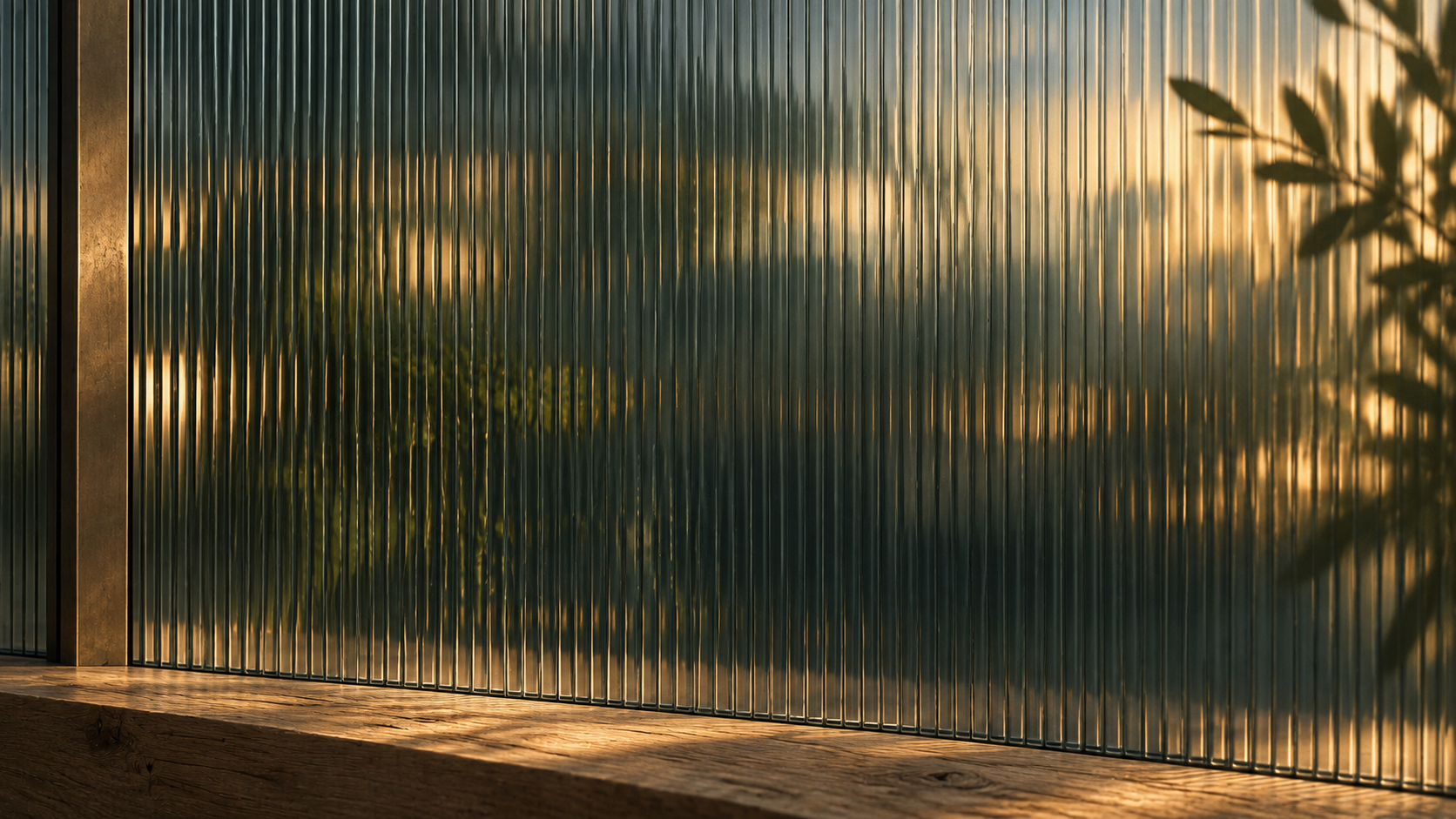
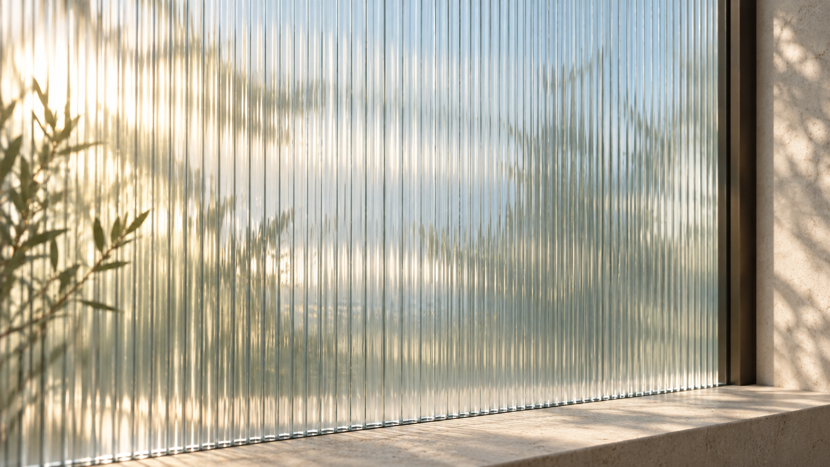
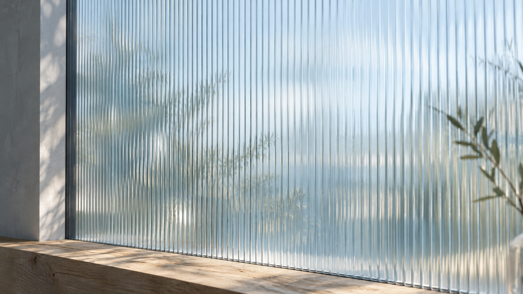
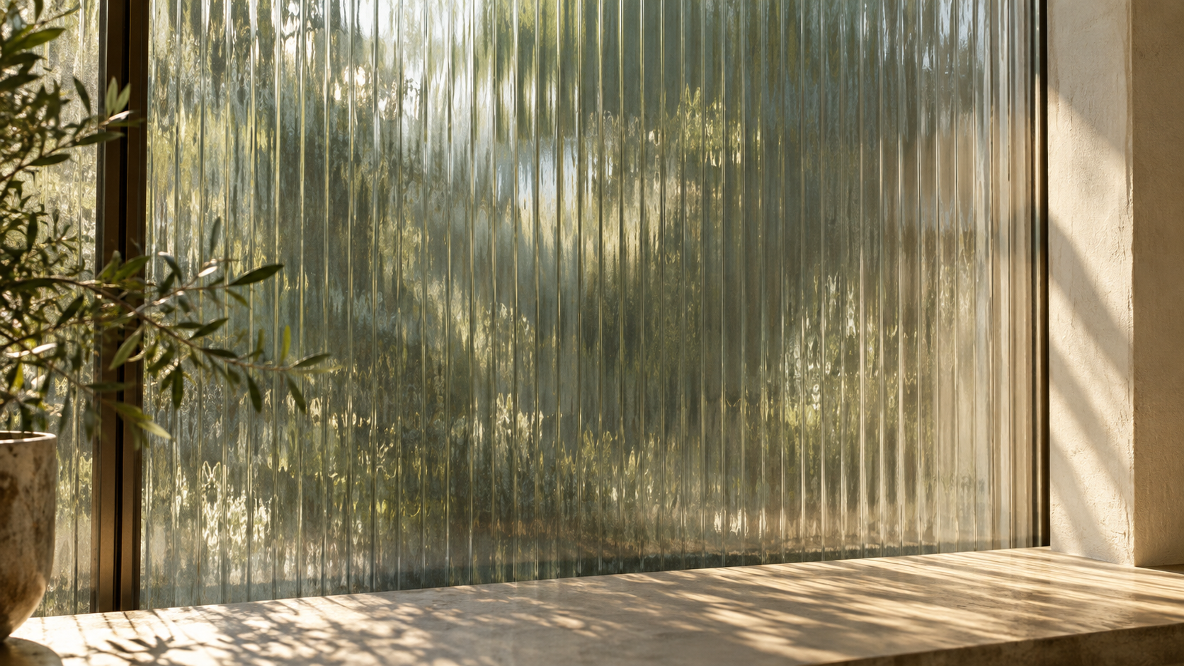
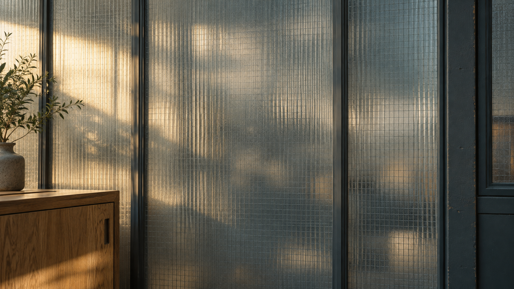
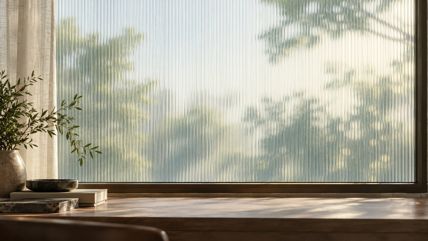
Architectural glass is the setting: ribbed surfaces, soft daylight, tactile materials, and a little natural imperfection. The product and the message stay in focus.
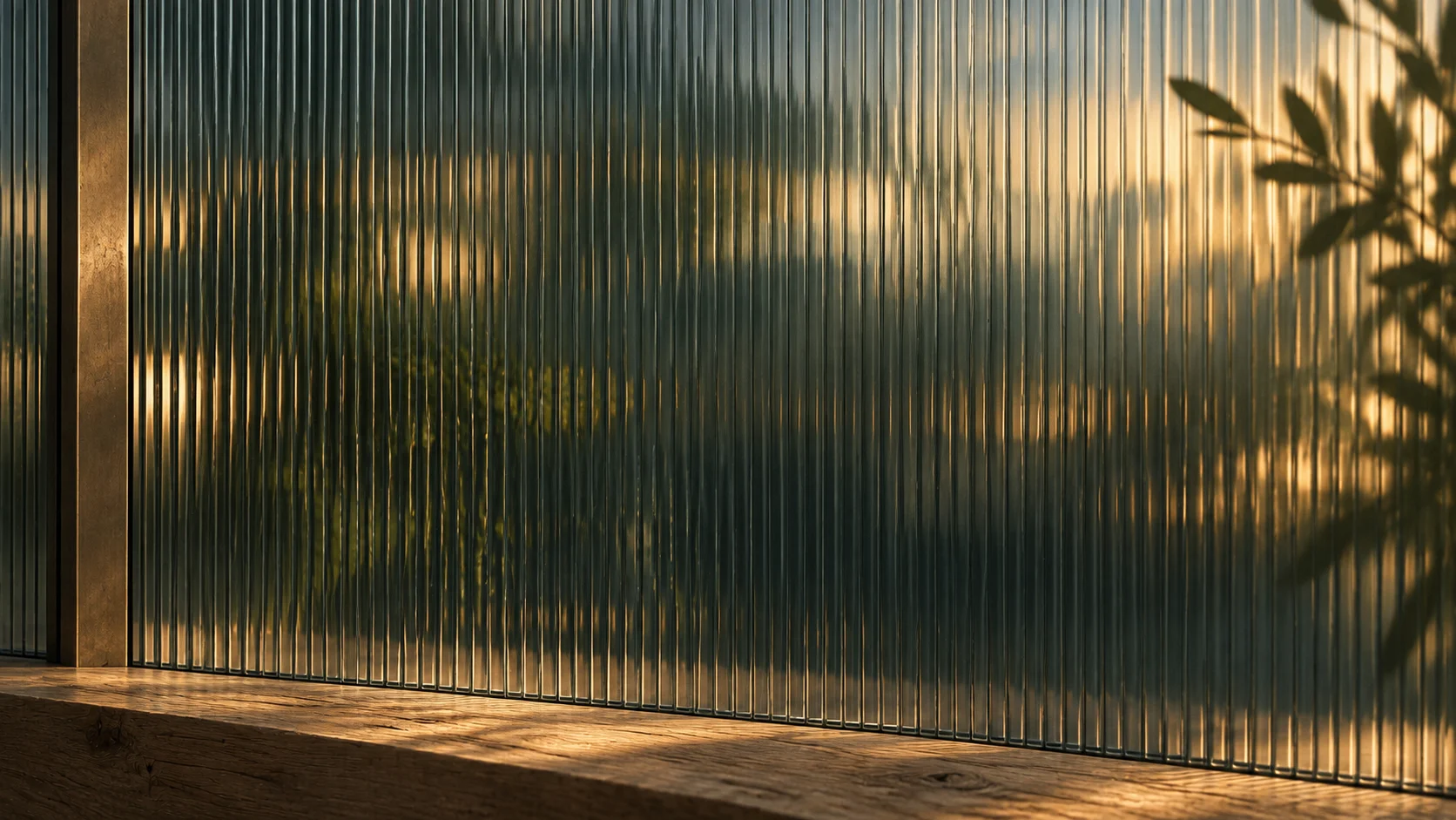
Deep green glass and a warm pool of light.
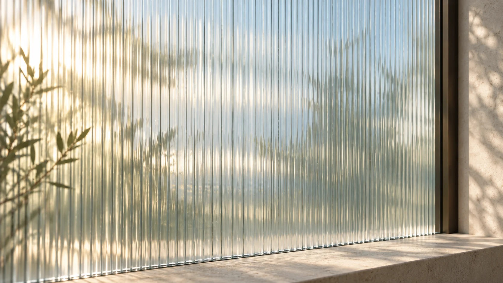
Pale glass, soft shadows, and a lighter field.
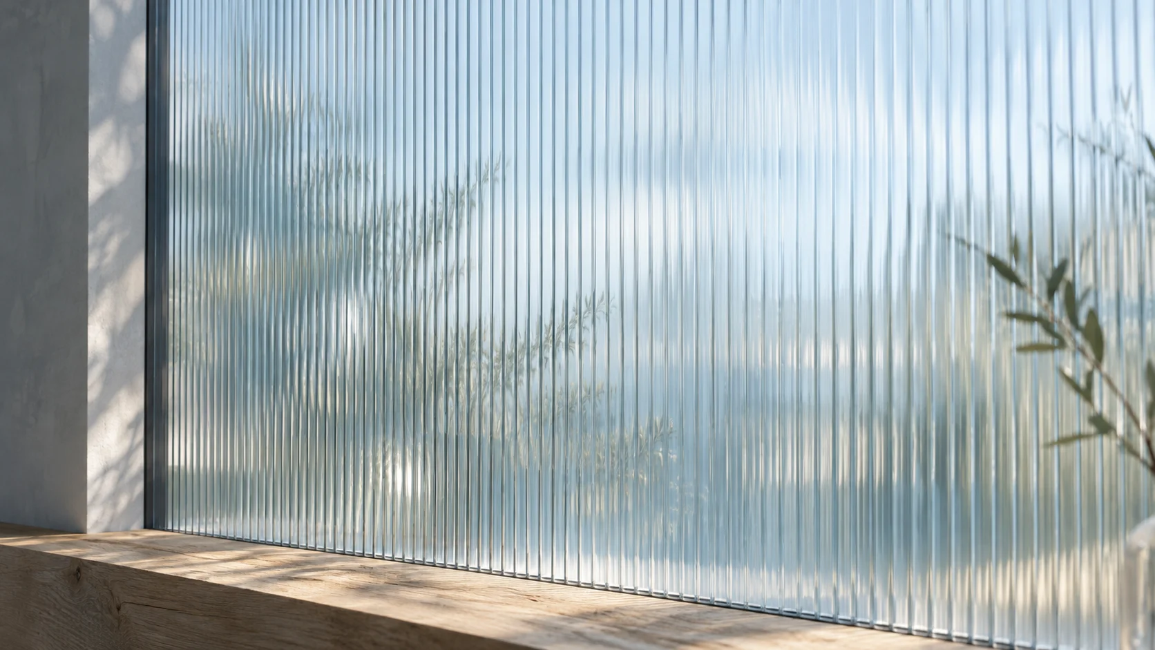
A cool architectural setting for Guide stories.
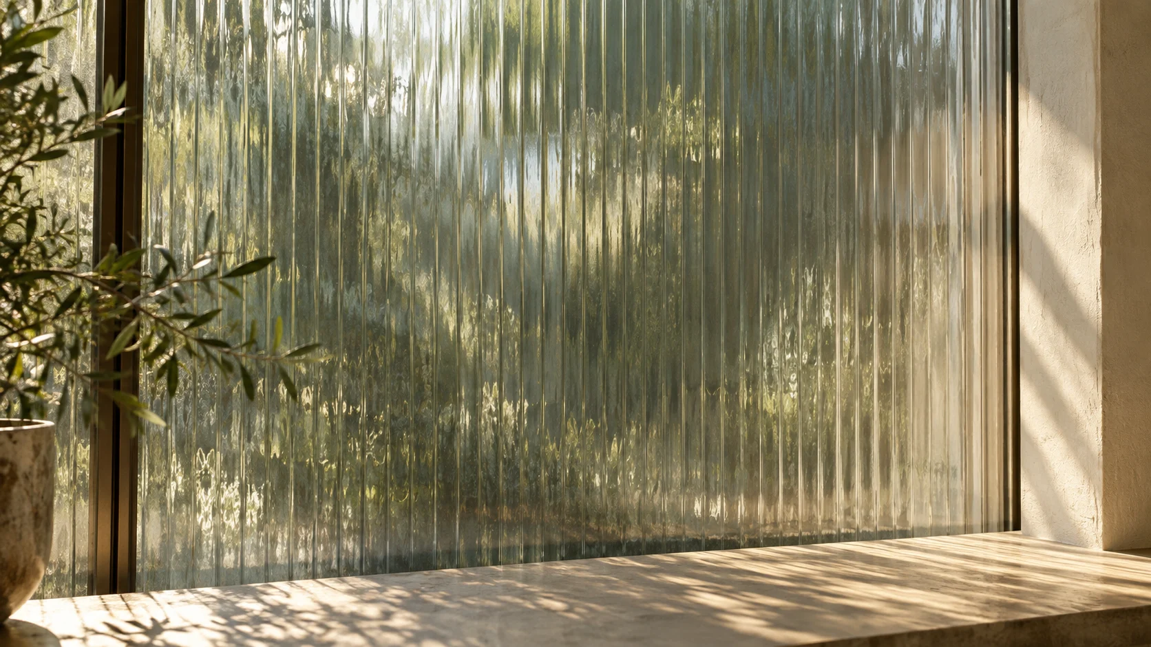
Natural texture around the shared browser.
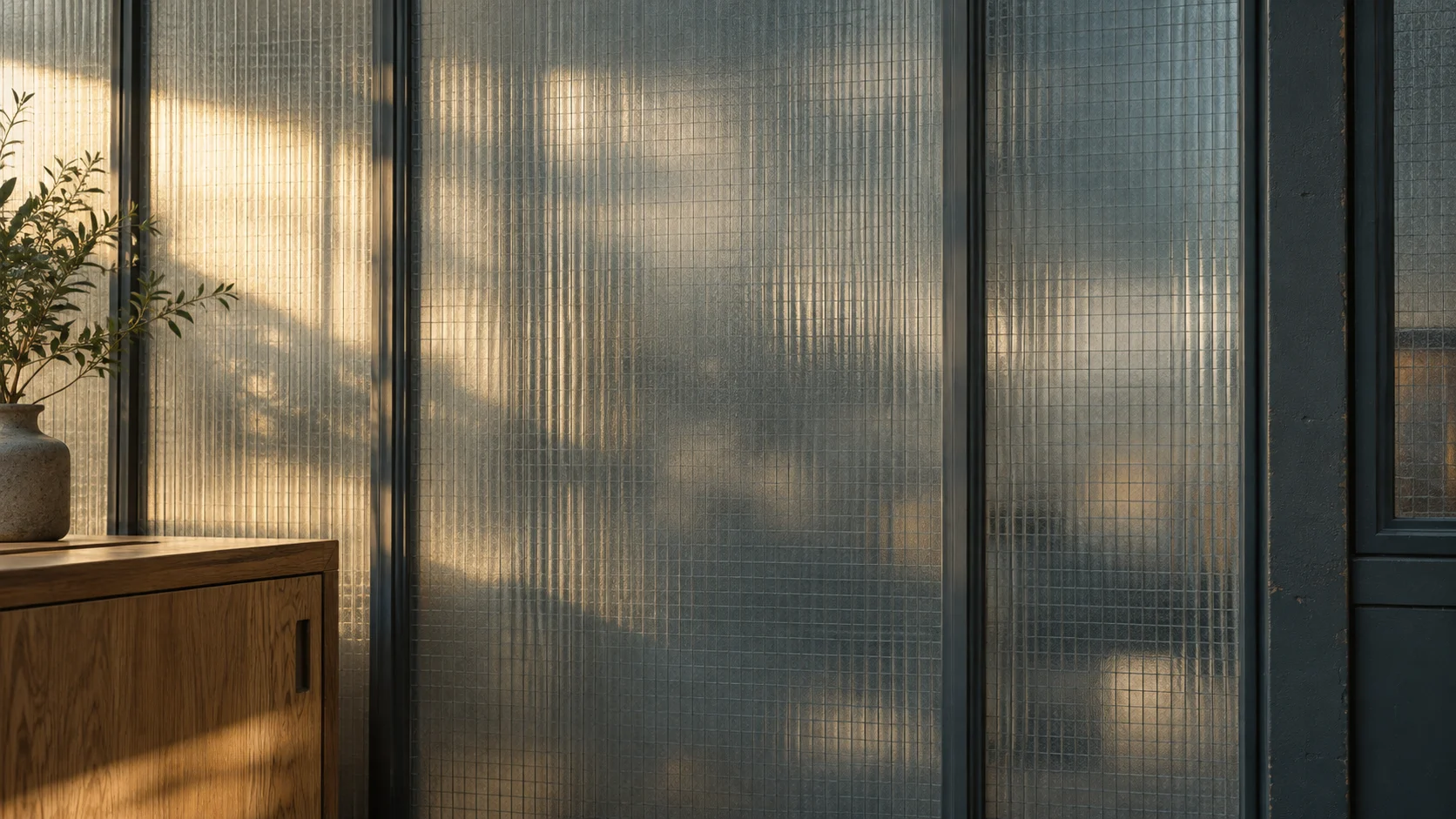
A calm backdrop for work across systems.
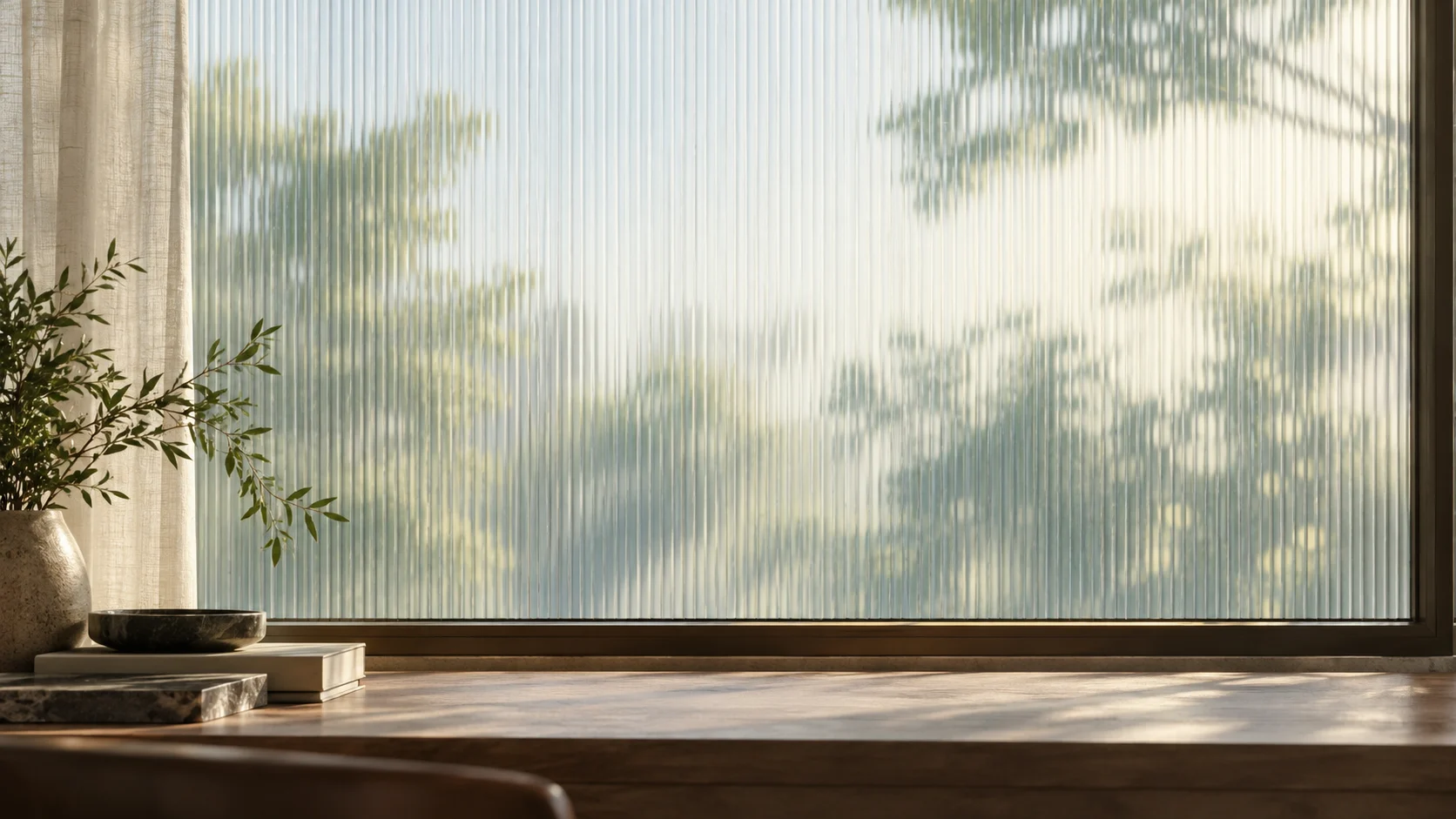
A distinct frame for the confirmed result.
Keep the family recognizable. Vary the light and composition, while repeating fluted glass, warm stone, muted greens, and soft blue-gray tones.
Leave somewhere for the story. Choose a quiet area for type or the product. Keep architectural details out of the reading path. Crop deliberately for each format.
Let materials provide depth. Use directional light, realistic reflections, and subtle texture. Avoid glowing edges, synthetic shine, and decorative interface effects.
Compose the type separately. The backgrounds are generated artwork. Logos, typography, and product UI are added from our actual assets, so they stay crisp and consistent.
An architectural interior photographed at human scale. Fluted glass, warm limestone or worn timber, soft directional daylight, restrained blue-gray and forest tones. Gentle plant shadows, believable reflections, fine material texture, and a quiet area for a headline or product frame. No lettering, logos, interface elements, neon, or exaggerated gloss. Match the existing references before adding a new image to the library.
04 / Product & motion
Lead with one customer’s story: a conversation, a useful action, and a verified outcome. Show the interface people will recognize when they open Thread.
Keep the product recognizable. Reuse the actual navigation, type, spacing, status colors, and components. Simplify the view around the action, without inventing a different app.
Make the work easy to follow. Text, email, and voice share the account history. Sidekick shows both cursors together. Back-office work ends with evidence from the source.
Label illustrative stories. Example accounts explain the product. They are not customer results. Performance claims and customer metrics always need a source.
Move with purpose. Cursor movements are quick; important messages stay long enough to read. Loops settle before restarting. Respect reduced motion and keep audio opt-in.
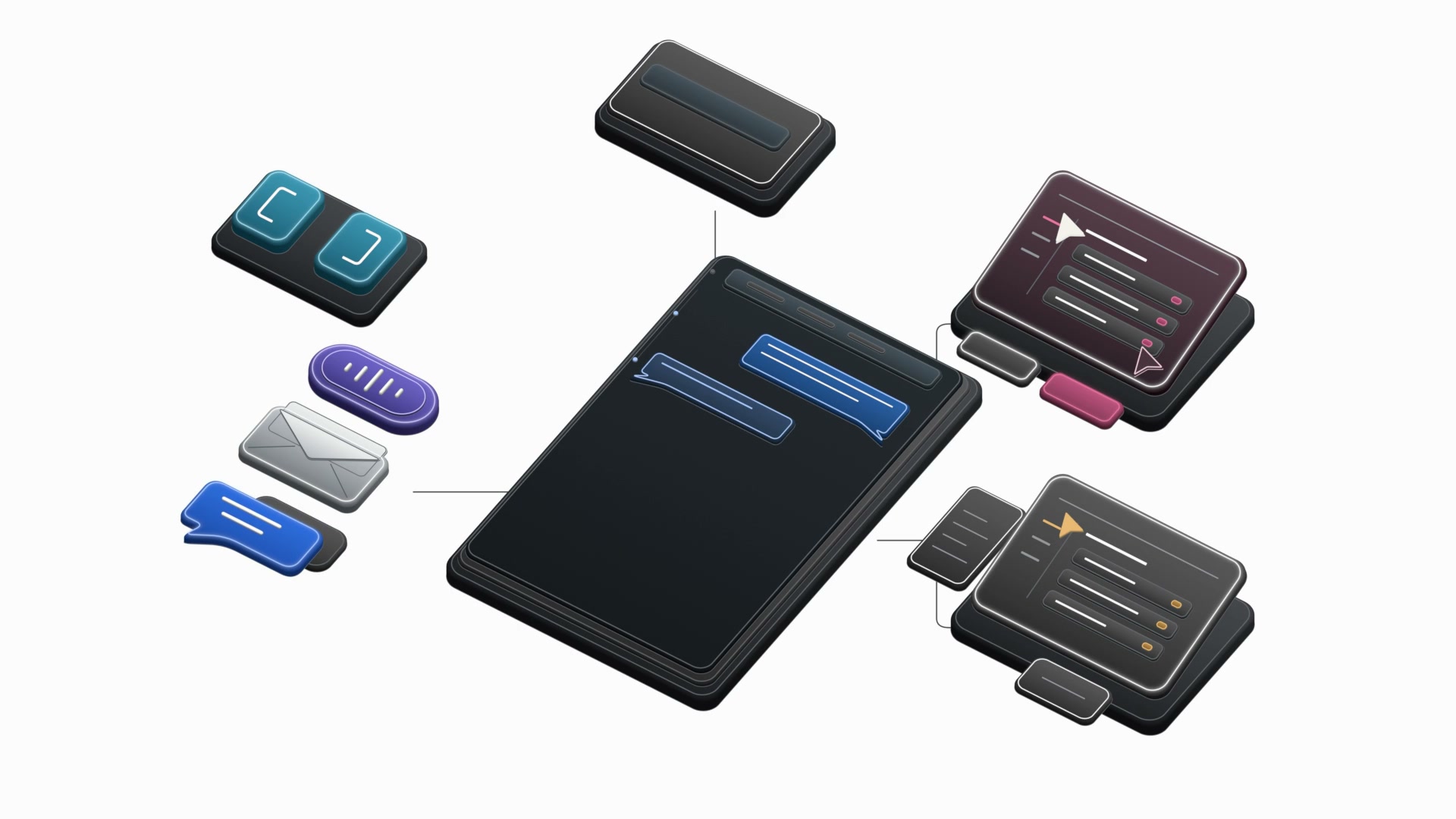
The reusable motion library
Use the dimensional components to explain how the system works. Keep their materials, channel colors, and motion consistent across scenes.
Explore the components06 / Downloads
The current imagery, social cards, LinkedIn covers, and original marks. Use the supplied files to keep every touchpoint in the same visual family.
Please preserve the logo and wordmark. Don’t use these assets to imply endorsement or partnership. For a co-brand lockup, get in touch.


05 / Social
One clear thought.
Room to breathe.
The logo and the promise are enough. Left-aligned type creates a consistent edge; generous space keeps it readable in a feed, a banner, or a small link preview.
Designed for the small crop, too. Keep the complete text block inside the central square. Remove extra copy before reducing the headline size.
LinkedIn, ready to use.
Dark and light covers for personal profiles and the company page. Upload at the supplied dimensions and check the crop in your profile.
Personal / Dark
1584 × 396
Personal / Light
1584 × 396
Company / Dark
1512 × 256
Company / Light
1512 × 256
Export sizes follow LinkedIn’s guidance for personal profiles and company pages. All covers are PNG files under 3 MB.